When Greig and I finished writing issue 1, we wanted to include some art with our submission. A visual to encourage IDW Publishing’s editors to give our script a chance. (Spoiler! It didn’t work.)
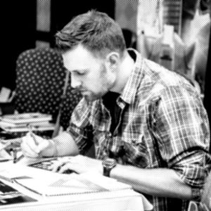
Casey Coller was always my first choice to do Transformers: REANIMATED. But he was not the first penciler we approached. I have so much respect for Casey as an artist, that I would have been devastated if he had said no.
The artists we went to before Casey were all busy with other projects at the time. While none of them said no to us, they needed time before they could start on our project. Greig and I were tired of waiting.
Having worked on this first script for over a year, we were ready to get it out the door and in IDW’s hands. After hearing from two other pencilers that we would have to wait, I spoke to Casey Coller in person at TFcon in Burbank last March. Casey sounded genuinely eager to read our G1 Transformers script, but let me know that he was on contract with Hasbro to do work on the Transformers Trading Card Game. That meant that he would be working on Transformers: REANIMATED art around his Hasbro obligation. Greig and I were happy with this arrangement. We got the artist we wanted for the project and he would be actively working on it, even if it was going to take a while to complete.
After returning home from Burbank, I wrote Casey an email with the attached script for ‘A White House For Peace’. He responded back after a couple of days saying, “Thanks for sending the script. I gave it a read this morning. Takes me right back to the old G1 style episodes :)”.
As you can imagine, this was more than encouraging to Greig and myself! Casey was the second person we had ever shown the script to, and our first choice for a penciler. Both people had liked the script and offered no suggestions, changes or corrections, which frankly, blew our minds.
Casey and I worked out the cost of doing a cover image and one interior page. Then I sent Casey the following description for the cover.
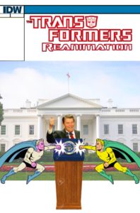
“I am going to refer you now to the attached image. It’s my mockup for a cover idea. The White House in the background and Ronald Reagan speaking at the podium. In the image I provided, he is giving the thumbs up. It’s just the first image I found. Thumbs up, or some other hand gestures (or no hand gestures), go with your gut. Optimus Prime coming in from the left to attack Megatron, who is coming in from the right to do the same.”
Casey wrote back saying, “Your cover idea is definitely something I can work with. I may suggest a few tweaks, but I think overall it’ll work well.”
I also told Casey that interior page 17 would be great to see rendered out. As a fan I didn’t get to see enough of the Missile-Armed Repair Drone from Optimus Prime’s trailer enough on the cartoon. That is why I picked page 17.
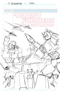
About three days later, we got our first glimpse of what Casey had been working on for our REANIMATED cover. Casey describes this early draft to me in his e-mail. “Attached is a quick sketch of a slightly tweaked version of the cover you described. It’s Reagan and a couple of secret service guys in front of the White House, with Prime and Megs in the foreground and the three classic seekers looming in the skies. Let me know what you think.”
Casey took my very crude concept for a cover and enhanced it tenfold. The addition of the secret service guys is genius and why didn’t I think about adding the seekers? Adding the seekers to the cover proved to me that Casey really did read and enjoyed the script. I loved that he changed the angle from a straight on shot of my concept to an angled one. It gives the cover depth and immersion that I could not visualize before.
I know I am biased here, but I feel this cover perfectly conveys the tone and chaos of the first battle in Issue 1. It gives the reader a window into story without making the reader feel like they were just spoiled when reading the scene.
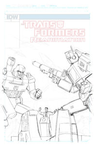
I received another update from Casey the very next day. “I had some time to chip away at the cover this morning, thought you might like a peek.”
I was so impressed when I saw this second draft I wrote Casey back saying, “This looks great! Reagan looks just like I would expect him to in the G1 Cartoon style. You’re kicking ass here! Thank you for the peek. I love seeing how this stuff all comes together.“
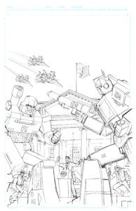
Two days later, I received another exciting update from Casey. “Since this is animation-style, I plan to do very clean lines, mimicking the cartoon as much as I can. Whoever you get to color it should go for a cel-shaded look on all of the characters, and a painted look for the background. (If you want it to look as close to the toon as possible.) Just my input 🙂“
Every time I got an email from Casey with updated art attached, it was like getting hit with an adrenaline shot. I mean… just look at the detail he has added to the White House! Of course, I wrote Casey back right away to tell him how amazing his art looked and thanking him for his coloring advice. At this point, the cover just needed to be inked and it would be complete.
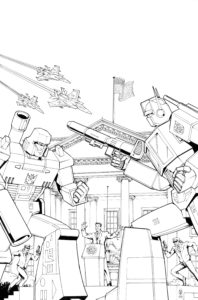
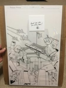
Due to Casey’s obligations with Hasbro we didn’t get another cover update until early June. If you ask me it was totally worth the wait! “Better late than never, right?” Wrote Casey. “Here are the cover inks for your project. I left the space very open (not a lot of heavy blacks/hatching, etc like you see in the comic style) so it looks more like the animated style once colored (sort of like the IDW Star Trek/TFs look). Let me know if this works for you. I’m happy to edit if you feel it would look better the other way.“
Greig and I loved how Casey finished off the cover and we told him just as much. We very much are going for the cartoon animated style and this hits all the right nostalgia strings.
When Casey sent me the original cover, he included a kind note wishing us luck.
I have been commissioning artists to do sketch covers for years. Including Casey Coller. Doing this has taught how to approach, communicate and commission artists for pieces of work. These lessons I have learned over the years only helped me when communicating with Casey.
When I approach an artist to do a piece, as I did with Casey and this REANIMATED cover, I often spend a long time composing my initial message to include everything I am envisioning. A detailed written description of what I am looking for as well as a visual aid if possible. Doing so reduces the back and forth with the artist and allows them to nail down what his client wants.
After I have sent an artist all this information, I let them do their thing. I don’t micromanage. When you approach an artist for a piece, it pays to be familiar with their style. That way, once you’ve told them what you want, you can picture how it is going to turn out and you can walk away and let them do their thing unencumbered.
In part 2 of The Art Of Transformers: Reanimated Issue 1, we will share how the interior of page 17 came together.
Don’t touch that dial!

Leave a Reply
You must be logged in to post a comment.